No products
Prices are tax included
Designing Artwork - Things to Consider
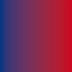
Using Gradients
When printing water-based, gradients are not suitable as there will be banding (the colours don't blend properly). Avoid using gradients of any kind when using water-based printing.
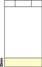
Designing near bottom
If you are thinking of putting information on the bottom half of the bag, make sure it is not too close to the bottom. Don't put any important information/images there as it may not be seen when the paper bag is filled with it's content.
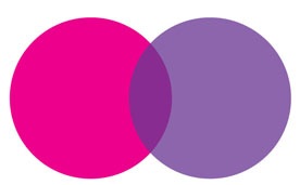
Colours Overlapping
With water-based printing, when you're printing two colours next to each other, there's a possibility that they may overlap slightly and make a new colour.
To avoid this try to have minimum amount of colours of your cup design.
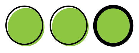
Colours not fitting into 'area'
When water-based printing using spot colours, if there is any movement in the plates, the colour may not fit into the area it is meant to go. To avoid this you could increase the line stroke to make it thicker. Print using CMYK may alleviate the problem, but please speak to our design team for clarification.
The only way you can truly tell what the cup will look like is to have it printed. These points may sound negative, but they enable you to design your cup template around these problems, meaning the process from producing artwork to print is a lot shorter. Our design team can help work through these problems to produce the best design possible.